Documentation UI update

Sometimes its easy to be focused on the big exciting things in tech like cloud migrations, automations systems, major version releases and app store releases meaning the less exciting things like UI refreshes get over looked.
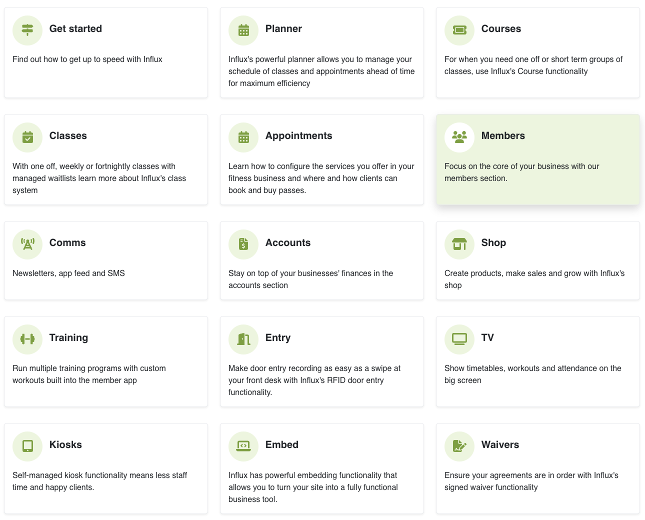
Well we’ve gone ahead and worked on that too with an updated look and feel to Influx’s documentation site.
The layout is easier to navigate, cleaner and more modern. We’ve got more improvements planned for the doc site too so will roll those out between out the regular cooler tech things like new feature releases for Influx.